Project Overview
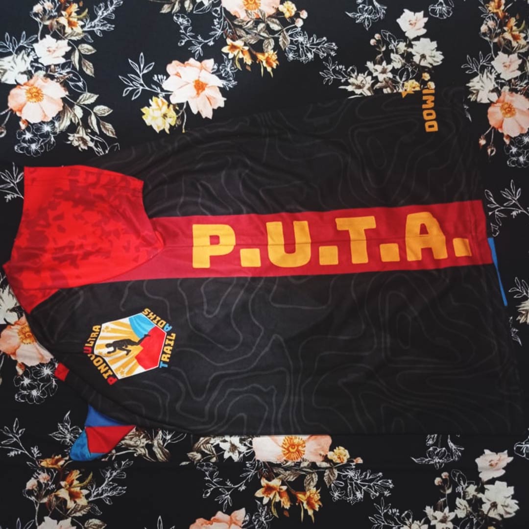
This was just a spur-of-the-moment gag with friends and somehow, it turned into a shirt design. You’ll never know when inspiration strikes, I guess.
Pinoy Ultra Trail Addicts. It’s simple, crass, and memorable. But obviously, it’s not something that will gain traction among the general public. Still, this was a good exercise.
Details
This design is basically a mish-mash of the design trends in trail running during the time. Elevation map textures are something that most trail runners can recognize. Not only does it break the plain solid color, it’s also a tell-tale sign of someone from the same sport.
Of course, the main colors are those of the Philippine flag. Red, Blue, and Yellow are great when it comes to making a Filipino identity, which is what the group is supposed to represent.
Not really a design I want to show off everywhere (hence the lack of pictures), but this one has good memories.
Application